Zendesk new UI layout issues | The place for Zendesk users to come together and share
Skip to main content
Accepted

Zendesk new UI layout issues

Related products:Admin center
  • April 16, 2025
  • 7 replies
  • 43 views

Zachary15

Hello,


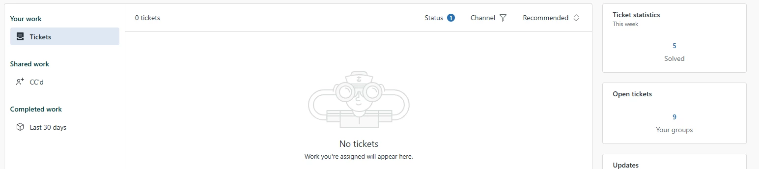
The new Zendesk UI has caused our ticket system nothing but problems tickets are no longer showing on the main ticket home page but they show up in the side box “open tickets”. Id rather the landing page just be open tickets if I have to click on it every time I want to view a ticket. Also in the new open tickets section tickets will not appear right away and take time populate even after the number goes up on the total number of tickets. There really should be an option to revert back to the old UI like most websites offer. 

7 replies

James18
  • April 23, 2025

The main ticket page has become almost unusable for us because it only shows tickets directly assigned to the agent, not the entire group. Like you said, we now have to rely on the “Open Tickets” side panel just to function day to day, which defeats the purpose of having a centralized dashboard.


To make things worse, the tickets in that panel don’t load immediately — even after the ticket count updates, there’s a delay before they appear. It’s made collaboration across our group really frustrating, especially when we’re trying to jump in and help with high-priority requests.


We’ve also noticed a noticeable lag in the new UI overall. What used to be a one-click process now takes several steps, and performance has suffered. There really should be a way to switch back to the classic view — or at the very least, customize the landing page so it defaults to something actually useful like “Open Tickets.”


Zendesk should consider how these changes impact group-based workflows. This rollout has made a simple process way more complicated than it needs to be.


Thomas90
  • May 7, 2025

Greetings,


I would like to add my feedback and agree with the said. The new layout is not offering the same functionality and in fact has taken away most and the most important overview.


Please revert the design of the “Home” back to the old layout as fast as possible!


To get the same functionality that the overview in ‘Home’ offered, we now have to go into the nested, way less intuitive sub-categories where we can sort the corresponding tickets only with a lot more effort. We have multiple same level agents working in the same group to solve incomming tickets and requests from our customers.


Previously, it was very easy to sort the tickets by urgency in the group. New tickets could be easily sorted using the New/Open assignment and shared among the agents.

The overview in ‘Home’ provided a good overview of the remaining quantity of open requests and each agent could sort and assign requests from this.


It was also very helpful to be able to ‘hide’ tickets that had already been answered (waiting, stopped, closed). If a customer replied to a ticket, you could see it directly because it appeared as open in the group or returned to the respective assigned agent in the ‘Home’ overview.


Please bring this back as fast as possible.


Shawna James
  • Community Manager
  • May 30, 2025
Hey Zachary,
 
Thank you for taking the time to provide us with your feedback. This has been logged for our PM team to review. For others who may be interested in this feature request, please add your support by upvoting this post and/or adding your use case to the comments below. Thank you again!

Zac13
  • Product Manager
  • June 2, 2025

Hi Zachary, Thomas, James-


Thanks for each of your thoughtful feedback.


I'm hearing that the capabilities of Agent Home, when compared to your business needs, doesn't facilitate group-based workloads as easily as the dashboard did. This is understood, and the vast majority of Zendesk users facilitate group-based workloads through views. In fact, we've published a guide to build a view that exactly replicates the legacy Dashboard: Support recipe: Creating a view to replicate the legacy agent dashboard. That said, we are interested in better facilitating the group-based workloads, and your comments about additional clicks are extremely important to us!


That brings us to the second point: if the impacts to your workflow are critical, you can deactivate Agent Home using this guidance: Activating and deactivating Agent Home. However, your feedback will not go unheard! We hope Agent Home is an experience you'll opt into in the future.


To summarize your feedback, I'm hearing a few major themes:

-It's easier for the team to work on New inbound tickets from the Dashboard than views because a) team members don't have to select a view, b) the most important filters are available with one click, and c) pending / on-hold tickets are automatically removed from view until a customer reopens them.

-It's easier to facilitate group-based workflows from the Dashboard because tickets assigned to groups appear by default without any further configuration.


Let me know if you'd add anything to my summary on specific functionality / use cases for the Dashboard!


Chaitali
  • Employee
  • June 3, 2025

Hi Zachary, Thomas, James : Thank you very much for sharing your valuable feedback. We have added this to our uservoice and as this more of a usability feedback than Accessibility, hence, Product Manager - Zac is taking this ahead! 


Shawna James
  • Community Manager
  • May 1, 2026
Under reviewAccepted

Thanks for highlighting these Zendesk UI layout issues. User experience plays a huge role in how efficiently teams can manage customer interactions. The same principle applies across industries, including real estate, where a clean and intuitive online experience helps buyers and sellers navigate listings more effectively. We've found this especially important when helping clients explore Dominican Republic real estate opportunities.