
Display name on x axis | The place for Zendesk users to come together and share
Skip to main content
Nick11
January 26, 2023
Question

Display name on x axis

  • January 26, 2023
  • 8 replies
  • 49 views

Hello everyon

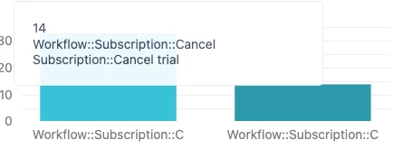
Is there a way to display only the final value of the metadata on the x-axis?


On my ticket metadata, I have "Cancel Trial" nested under Workflow and I was wondering, is there a way for me to display only "Cancel Trial" on the x-axis of the report?
Currently, its showing the whole nest and gets truncated.


Is there a better way to do it? Open to feedback! 
 

    8 replies

    Christopher15
    January 26, 2023

    Hey @nick11, it looks like 'Workflow::Subscription::Cancel trial' might be a nested custom field. There is a great article here that walks you through how to isolate the different levels of a nested dropdown field into their own attributes. You would then add the attribute for your third level to the column.

    Nick11
    Nick11Author
    January 30, 2023

    Hi @christopher15
    Thank you for the suggestion, I've tried it, and works perfectly. But I have a problem with the visualization, when I add this report to my dashboard, the result gets truncated and forces me to scroll for the rest of the results, is there a way I can set it to fit to screen instead of scrolling?

    Christopher15
    January 30, 2023

    Glad I could help Nick. You should be able to adjust the width on the report so that there's no horizontal scroll. If the default dashboard size isn't wide enough you can make it bigger by going to the 'Dashboard' tab and selecting 'Dashboard width':

    Nick11
    Nick11Author
    January 30, 2023

    Hey @christopher15 I tried as per your suggestion but I don't think that solves the issue.

    If you look at the screenshot below. You can see I've extended the report width but it somehow still gets truncated.

    Do I have to alter something within the report itself? 

    Christopher15
    January 30, 2023

    Hey Nick. What do you mean by 'truncated'? I can't see a scroll bar anymore. What are you expecting to see that you can't see?

    Nick11
    Nick11Author
    January 30, 2023

    @christopher15 

    This is what I get atm. I've extended the width but somehow the report sticks to a certain ratio..
    I tried checking and unchecking the fit-to-screen option under the report settings but doesn't seem to be like changing much.

    Any ideas?

    Christopher15
    January 30, 2023

    I'm really not sure on this one. Is it that you're missing values in 'List level one' and 'List level two'?


    Employee
    February 7, 2023
    Hi Nick,

    How the table is displayed on the dashboard should be similar to how the report looks like at the report level. Adjusting the size of the widget or the tab won't automatically change the size of the actual table/report. Usually, the column width adjusts based on the values inside the cells. But you can manually set the width of the columns via the Chart configuration menu (on the actual report). See Setting column width.