So this has been like this for over a year and still Explore can be pretty frustrating. The fact that you can not Discard Changes is crazy. If you make any changes while in the editor it's there even if you do not want it. If you bulk change something like a move, then Undo undoes the move one by one, which kinda makes sense but also can be annoying. The sizing of things is also frustrating. For instance...
Why is there all the wasted space in there? If i move the legend to the right the graph gets bigger, but there is still a two grid open space at the bottom. Is there a way to change that?
Why do the text boxes have to be so big? This is 'normal' size text and if i make the box any smaller it sticks a scroll bar on the box even though the text fits just fine.
This just makes everything a mess when you are trying to organize any dashboard unless you make everything huge. Explore vs GoodData.
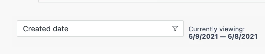
Is there a standard grid size that should be used to make this work/look better? You can't change the date/time filter size at all (that i have found) so grid size 1 is really messy. Mostly because you have to have a box 2 boxes in order not to see a scroll bar. A size 2 grid seems to work best, but I am open to others observations about dashboard creation and sizing. Page size is also giving me headaches as it seems to work much different in Explore. Most things seem to be doubled in size from what i can see.
But short of making a copy of a dashboard/tab before you make any changes so you can delete the tab and start over if you have to we need this back in some fashion sooner rather than later... I know there is a thread on this that is over a year old with little response. This should have been in there from the very start.