

Problem Statement
The Proactive Tickets App helps build better relationships with your customers by allowing you to proactively reach out to them via Zendesk Support tickets. The app allows you to search a list of your users based on any searchable user field, and then create tickets in bulk on their behalf.
Screenshots
Prompt
Create a nav_bar app called "Proactive Tickets" that lets agents search for end users, build a ticket template, and bulk-create one support ticket per selected user — then create a Zendesk view to track all those tickets.
Add two settings to the app so admins can configure them during installation:
- `newStatusTicketFieldId` — labelled "Status field ID". Help text: "The ID of the ticket status field. Find it under Admin > Objects and rules > Tickets > Fields." Required, type: number.
- `numberOfUsersPerPage` — labelled "Users per page". Help text: "Number of users to show per page in the search results." Type: number, default: 20.
Read these settings from the app registration event metadata. = The app is a 4-step wizard. Show one step at a time. Each step has a round dark teal circle with the step number in white, followed by the step title in bold and a grey description line below it. Separate sections with thin horizontal lines.
**Step 1 — Search for users**
- When the app loads, read the "Status field ID" from the app settings (`metadata.settings.newStatusTicketFieldId`). Call the Zendesk API at `/api/v2/ticket_fields/{newStatusTicketFieldId}.json` to fetch that field. While this call is in progress, show a loading spinner. If the call fails, or if the response's `ticket_field.type` is not exactly `"status"`, or if `ticket_field.system_field_options` is missing, stop and show only a red error banner across the full width with an info circle icon and the message: "Invalid Status ticket field ID. Ensure that you saved the correct Status ticket field ID in order to use this app." Do not show the search form or any other content — the app cannot proceed without a valid status field. Only if the call succeeds AND `ticket_field.type` is `"status"` AND `ticket_field.system_field_options` is present, proceed. Check whether any option in `system_field_options` has `value` equal to `"hold"`. Remember whether "On Hold" is available — you will need this in Step 2 for the Status dropdown.
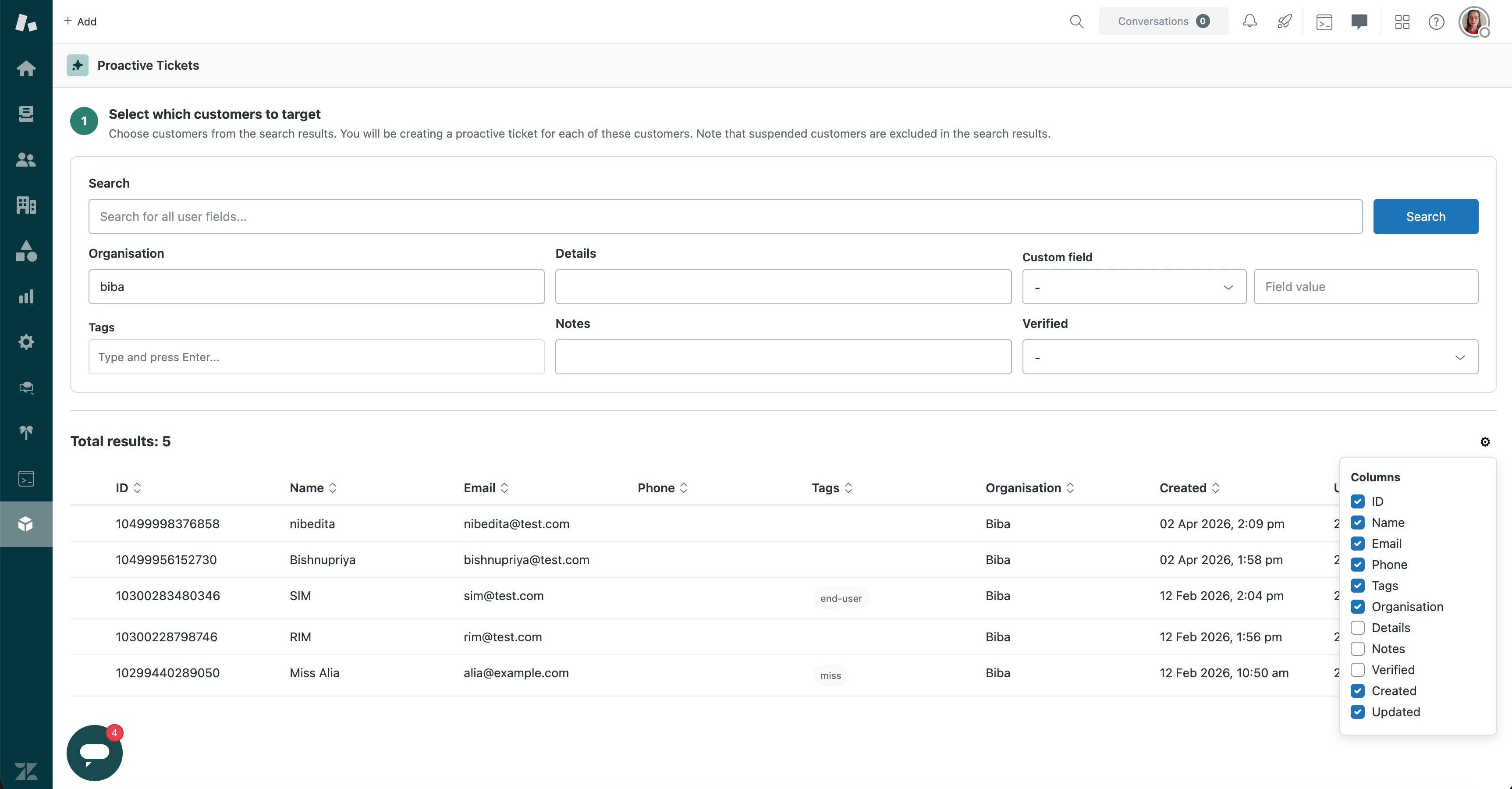
- Show the step header with a teal circle labelled "1", the title "Select which customers to target", and the description "Choose customers from the search results. You will be creating a proactive ticket for each of these customers. Note that suspended customers are excluded in the search results."
- Below the header, show a search form inside a rounded light-grey bordered card with generous padding. The form is laid out in a grid of three rows:
- **Row 1:** A wide search input with placeholder text "Search for all user fields..." taking up about a third of the width, with a solid blue "Search" button right next to it.
- **Row 2:** Three equally spaced fields — "Organisation" (text input), "Details" (text input), and "Custom field" (a dropdown defaulting to "-" followed by a text input for the field value side by side).
- **Row 3:** Three equally spaced fields — "Tags" (a tag input where the agent can type and press Enter to add pill-shaped tags with an x to remove them), "Notes" (text input), and "Verified" (a dropdown with options: "-", "Yes", "No").
- Pressing Enter in any text field triggers the search.
4. Fetch all custom user fields from the Zendesk API at `/api/v2/user_fields.json` for the Custom field dropdown. When the agent picks a custom field, change the input next to it to match the field type: a checkbox for checkbox fields, a date range picker for date fields, a dropdown for dropdown fields (using the field's own options), a multi-line text area for textarea fields, or a plain text input for everything else.
5. When the agent clicks Search, build a search query from all the filled-in fields and call the Zendesk search API at `/api/v2/search.json` with `type:user role:end-user is_suspended:false` plus the search terms. Append each non-empty field as a query term — for example `organization:Acme*`, `details:value*`, `tags:tagname*`, `notes:value*`, `is_verified:true`. For custom fields, append `field_key:value` (add a `*` wildcard for text and textarea types). For date custom fields, use `>=` and `<=` operators with YYYY-MM-DD format.
6. The search API uses offset-based pagination (100 results per page). Fetch up to 10 pages maximum (1,000 users). Also fetch all organizations from `/api/v2/organizations.json` (cursor-based pagination, up to 10 pages) so you can display each user's organization name instead of just the ID.
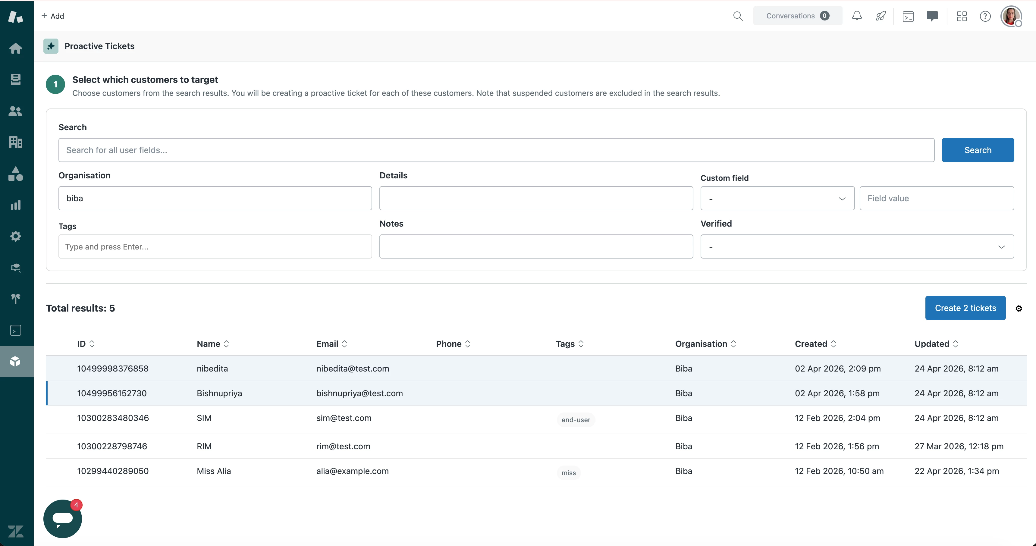
7. Below the search form (separated by a thin line), show a status bar with "Total results: N" on the left side in bold large text. On the far right, show a gear icon. When clicked, the gear icon opens a small popover titled "Columns" with a checkbox list of all available columns: ID, Name, Email, Phone, Tags, Organisation, Details, Notes, Verified, Created, Updated. ID, Name, Email, Phone, Tags, Organisation, Created, and Updated are checked by default. Details, Notes, and Verified are unchecked by default. Toggling a checkbox shows or hides that column.
8. Show a table of results. Each row has a checkbox on the far left, then the visible columns. Column headers are sortable — clicking a header toggles between ascending and descending sort (show a sort arrow icon). Date columns (Created, Updated) display in "DD Mon YYYY, HH:MM am/pm" format. Tags display as small grey pill-shaped badges. Selected rows get a light blue background tint. Clicking anywhere on a row toggles that row's checkbox.
9. The header row has an unlabelled checkbox on the far left (no "Select all" text). When all users on the current page are selected it shows checked; when some but not all are selected it shows an indeterminate dash; when none are selected it shows unchecked.
10. Implement client-side pagination using the `numberOfUsersPerPage` setting. Store all fetched results in memory and slice them into pages of `numberOfUsersPerPage` size. Show numbered page buttons centred below the table.
11. When one or more users are selected, show a button in the status bar (between "Total results" and the gear icon) labelled "Create 1 ticket" or "Create N tickets" matching the selected count. Clicking it moves to Step 2.
---
**Step 2 — Configure the ticket template**
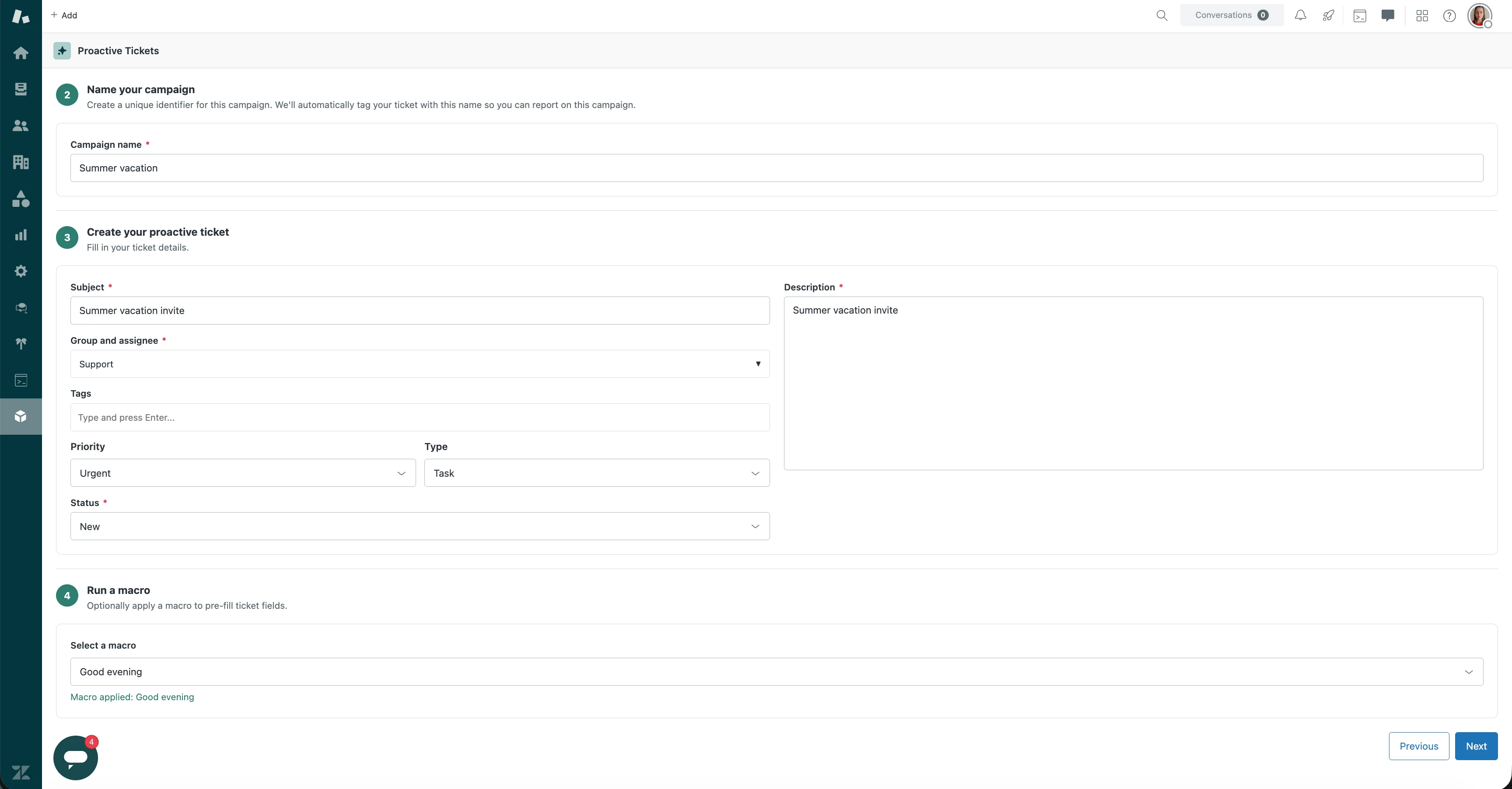
12. Show a teal circle labelled "2", title "Name your campaign", description "Create a unique identifier for this campaign. We'll automatically tag your ticket with this name so you can report on this campaign." Below it, inside a bordered card, show a "Campaign name" text input marked as required (red asterisk after the label). Show a validation error below it if left empty.
13. Below that (separated by a line), show a teal circle labelled "3", title "Create your proactive ticket", description "Fill in your ticket details." Below it, show the ticket form inside a bordered card using a two-column layout:
- **Left column:** "Subject" (required, text input with red asterisk) at the top, then "Group and assignee" (required, a drill-down dropdown with a red asterisk). The first level lists all groups, each shown with a group icon (two-person silhouette) and a right-chevron arrow. Clicking a group drills into it: the dropdown replaces its contents with a "Back" link (left-chevron) at the top, the group name in bold with a group icon, and the group's individual members listed below with single-person icons. The agent can select the group name to assign the whole group, or select a specific member. Fetch assignable group memberships from `/api/v2/group_memberships/assignable.json?include=users,groups` (cursor-based pagination, up to 10 pages). Then "Tags" (tag input with pill-shaped removable tags), then "Priority" and "Type" side by side on the same row (both are dropdowns defaulting to "-"), then "Status" (required dropdown, full width of the left column). For the Status dropdown, use the result from step 1 — if "On Hold" was not available in the status field options, do not show it in this dropdown.
- **Right column:** "Description" (required, a tall multi-line text area with red asterisk) filling most of the right column height.
14. Below the ticket form (separated by a line), show a teal circle labelled "4", title "Run a macro", description "Optionally apply a macro to pre-fill ticket fields." Below it, inside a bordered card, show a bold label "Select a macro" above a dropdown defaulting to "-" listing the macro names. When the agent picks a macro, show a green confirmation message below the dropdown: "Macro applied: {macro name}". Fetch all active macros from `/api/v2/macros/active.json` (cursor-based pagination, up to 10 pages) to populate this list. When a macro is selected, apply its actions to the ticket form above. Macro actions can set: subject, description (HTML), status, type, priority, group, assignee, tags (add, remove, or replace), CCs, custom fields, and ticket form. For the description action, replace `<` and `>` with `<` and `>`. For the group/assignee actions, look up the matching membership from the already-fetched group memberships.
15. At the bottom right, show a white outlined "Previous" button and a solid blue "Next" button side by side. The "Next" button is disabled until campaign name, subject, description, group/assignee, and status are all filled in.
---
**Step 3 — Confirm and send**
16. Show a large bold centred heading "Measure twice. Cut once." Below it, centred text: "You are about to create a proactive ticket on behalf of **1** customer." (or N customers if more). Below that: "They will receive an email notification with the below ticket details."
17. Show a progress bar spanning the full width — a thin horizontal bar that fills with blue as tickets are created.
18. Below the progress bar, show a bordered card containing the ticket summary in a two-column grid of label-value pairs:
- **Left column:** Campaign name, Subject, Group and assignee (shown as "GroupName - AgentName"), Priority.
- **Right column:** Type, Status, Tags (shown as grey pill badges), Description.
- If a macro was applied, also show any extra fields it set (ticket form, CCs, custom fields) below the main summary.
19. Automatically add a tag based on the campaign name (replace spaces with underscores) to the ticket's tags before creating. This tag is used to build the view.
20. At the bottom right, show "Previous" (white outlined) and "Send" (solid blue). When the agent clicks "Send":
- First, create a Zendesk view by calling POST `/api/v2/views.json`. The payload must be nested inside a `"view"` key and the conditions must be inside a `"conditions"` object with an `"all"` array. The tag condition field must be `"current_tags"`, not `"tags"`. Also include a `"description"` field set to the campaign name. For example, if the campaign name is "XYZ", the payload should look like: `{"view":{"title":"XYZ","active":true,"description":"Description for XYZ","conditions":{"all":[{"field":"current_tags","operator":"includes","value":"xyz"},{"field":"status","operator":"less_than","value":"closed"}]}}}`
- Then create one ticket per selected user by calling POST `/api/v2/tickets.json` for each user. Set the `requester_id` to the selected user's ID and the `submitter_id` to the current agent's ID. Send the description as `comment.html_body` (convert newlines to `<br />`). Send all tickets at once and update the progress bar as each one completes.
- While sending, disable both the Previous and Send buttons.
- If some tickets fail, show an error banner at the top listing the users it failed for, and let the agent retry for just those users (don't re-create the view on retry).
---
**Step 4 — Done**
21. Show a centred success screen with a large "Done!" heading, a Zendesk logo, a message that tickets were created and a note about the view, and a clickable link to the view. The link should point to `{origin}/agent/filters/{viewId}` (where origin comes from the app's URL parameters).
22. Show a blue "Create tickets again" button that resets the entire wizard back to Step 1 with a clean state.
Enhancement Options
Based on your organizational needs, you can extend the Proactive Tickets app to support your specific needs using App Builder.
Important Note: This app recipe is for the Proactive Tickets app. Any modifications to the recipe or its underlying logic may alter the core functionality of the app. Thoroughly test all changes in a non-production environment before deploying to your production workspace.
Please note: that as App Builder evolves including updates to underlying AI models, design components, and other dependencies, we cannot guarantee that this recipe will continue to function as expected over time. We recommend periodically validating the recipe against any platform updates.